GUEST BATH PROGRESS

Happy Monday! Seems like y'all all enjoyed the football themed post on Friday and I'm really looking forward to this weekend's! I'm still trying to decide on a team, but I'm having so much fun working on that series! In other news, it's high time for a Wrightwood update and today I'm looking at the guest bathroom. At the moment working on the house feels a lot like being on a treadmill, we're putting forth a whole lot of effort and it feels like we're really not getting anywhere. There is just so much sanding - we made the decision long ago to keep as much of the original woodwork in the house as possible (hence the forthcoming, extensive breakdown of how we refinished the original floors all by ourselves!) and that means sanding 80+ years of paint off, repairing any damaged spots, priming, and repainting. So fresh and so clean clean. On an unrelated note we're all having minor respiratory issues....ah, the importance of wearing face masks. Anywho...if you recall from the post about the upstairs the place the guest bathroom now occupies was originally the upstairs half of the duplex's kitchen. We broke up that square footage into a little toilet stall for the upstairs master bath, a chase (architect-speak for a vertical tunnel from the attic to the downstairs) for the newly installed air conditioning, and a generous guest bath that will serve the two bedrooms upstairs.
For this bathroom I want something warm and inviting, while my tendency towards all white everything hasn't been lessened one bit. Having started with the grime and dirt encrusted house we purchased and living in the house with it's constant layers of sawdust and paint chips all I want in the world is white clean spaces. With that being said I settled on a warm grey for the walls in this bathroom and the vanity is a dresser we found for $150 at a local resale shop. Other than structural changes so the dresser can hold a stone top and sink, we will be leaving the dresser as-is. The finish of the wood and the grey walls give the room a vintage warmth that contrasts nicely with all the crisp white tile. Speaking of tile the inside of the shower/tub is all white subway tile (affordable and good-looking) and the floor is a 2" white hex tile. Two inch hex tiles are a little bolder and more modern than the teensy 1" hex tile you typically see (that, and since we're tiling ourselves and the 2" tile comes in 1-foot by 2-foot sheets it will make the install go that much faster). This bathroom is filled with light, having two big windows facing east along one wall - and even better, no one can see in through them because the house is so much taller than the neighbors! The feel is equal parts light and bright with a warm, aged, vintage feel so we don't get too far away from the historical spirit of the house. I think this might be shaping up to be my favorite room! We're on schedule to tile within the next could weeks, and we still need to order lights and a mirror. The shower is installed and tiled and I've been taking advantage of the fact that I no longer have to go to the yoga studio to take a shower.
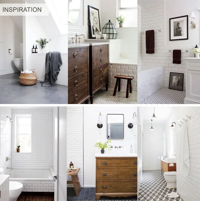
While I wish i could say we're going with brass fixtures in here like in the kitchen, truth be told it's easier (and cheaper) to find chrome. Luckily chrome is of the period and looks really pretty on white tile too. Lately I've been falling in love with some black details and I'm a total nut for mixing metals - I really like how it's all coming together!
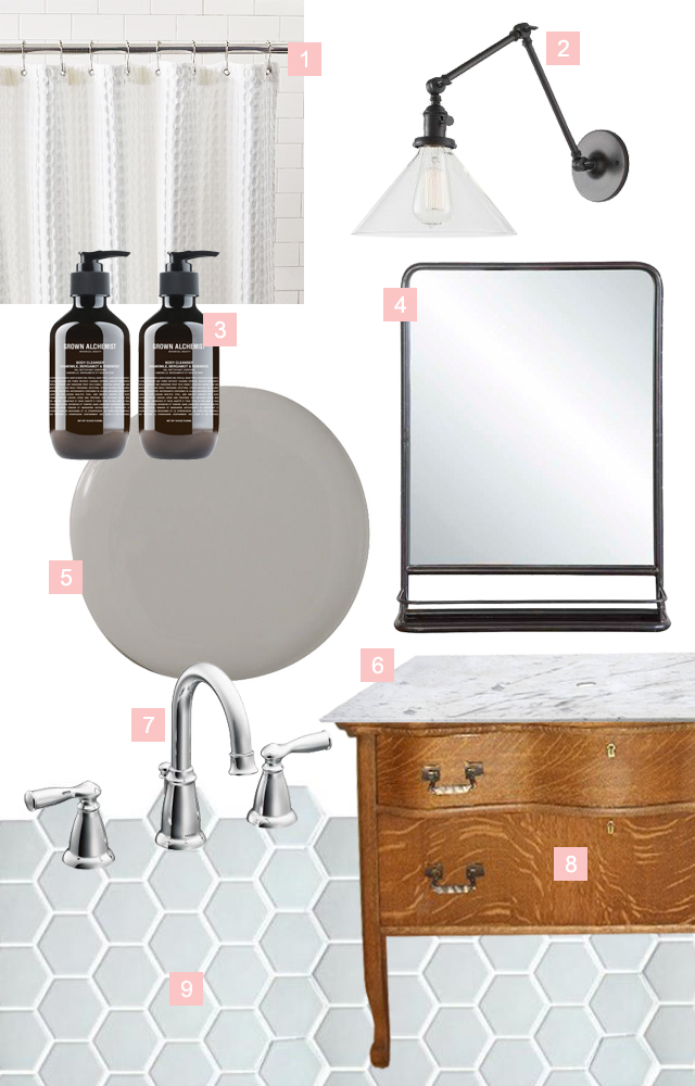
1 | A CLASSIC SHOWER CURTAIN
I finally made the switch from my crazy, oversized teal and brown floral shower curtain to this white waffle weave shower curtain just before I moved out of my apartment and it makes me feel like I'm in a gorgeous hotel every time I look at it. The best part is that it just looks expensive. The guest bathroom with be it's home for now.
2 | VANITY LIGHTING
I'm in love with this articulated light fixture from School House Electric and I've been really digging black as a finish lately too. In a perfect world we would have flanked the vanity mirror with sconces, but this one slipped through the cracks and we only have a single fixture above the mirror - not the end of the world by any means. There is plenty of light in this bathroom and I'm sure a single overhead light is going to be just fine.
3 | GREAT BODY WASH
This body wash from Grown Alchemist looks good in your shower and feels great on your body. Yeah these aren't exactly a permanent finish in this bathroom, details can make a space. I dream of the day that everything in my house is packaged beautifully and coordinates with each room. Until then, I will continue to hide my piles of product in baskets and drawers.
4 | VANITY MIRROR
I have been in love with this mirror forever. With this bathroom having so much less countertop space I think the little shelf on this mirror could be a big help. I have found a similar, more modern rendition here.
5| PAINT COLOR
Of the 3 things actually installed in this bathroom right now, one of them is the paint color. Deciding the color was actually a happy accident, this color (Sherwin Williams Grey Sanctuary) was supposed to be in the kitchen but ended up looking too muddy in there. We had already purchased a gallon, so we tried it in the Guest Bathroom and voila! it's perfect. Colors change so much from room to room and light to light that I knew this would work somewhere!
6 | COUNTERTOP
The vanity countertop, when we get around to it, will be a slab of Carrara with an undermount, oval sink. Again, just like in the kitchen, we're still pricing and finding just the right piece of stone, so this will probably be the last thing installed in here. Please excuse the obvious photoshop work too...the things I do to try to show y'all whats in my head...
7 | SINK FAUCET
This faucet from Moen matches the chrome fixtures in the bathtub. I am totally a convert to this goose-neck faucet in the bathroom. Once upon a time I was under the (very wrong) impression that I would hit my face on it every time I go to splash water on my face. I couldn't have been more wrong! This faucet shape allows for so much more room in the sink area! I might be in love.
8 | VINTAGE DRESSER TURNED VANITY
This is not our dresser. The only photos I could find of the actual piece we purchased were also terrible (and I'm not about to add to the deluge of awful oak dresser photos online, there are plenty enough as is). This finish is close to what we're working with (minus the tiger-striping) though our shape is a little more simple. The hardware is even pretty close - how cute is that keyhole detail?
9 | FLOORING
The flooring! I'm so excited to finally get this stuff installed. We ordered this 2" hex tile in white from Daltile and the order finally came in in mid August. Tiling is no small feat though and it's taken a little while to just get our heads wrapped around how much we have to do, but now that the paint is up on the walls the floor tile can go in! Cross your fingers we get it done soon!
I think this room is really coming together nicely if not slowly. I'll leave you with a few messy little iPhone progress shots of what the space is looking like these days. Hopefully this will be the first room to be 100% completed! (Ok I lied, I am putting another poor quality photo of a dresser into the world...)
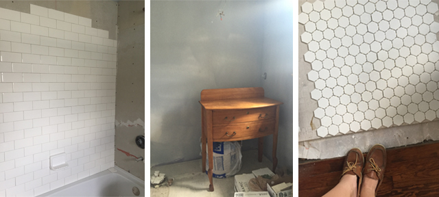
Left to right: Shower wall tile mid-install, the soon-to-be-vanity dresser, and the floor tile going in


IT'S (FINALLY) GAMEDAY

I was recently asked "If you could add a thirteenth month to the calendar year, between which two months would you put it?". My immediate response of course was "Septober!". I would absolutely slip another month in right now! I love fall, especially early fall, the anticipation of cooler weather (with enough heat to still justify trips to the lake or the river!) and as many of you know, football season started last weekend. Ya'll, it's my favorite time of the year. I've decided to set myself up with a little challenge. Every Friday, from today until the end of football season, I'm going to put together a room based off of a college football team. The catch is that is has to be a room even a fan of a rival team would love to be in. So none of this:

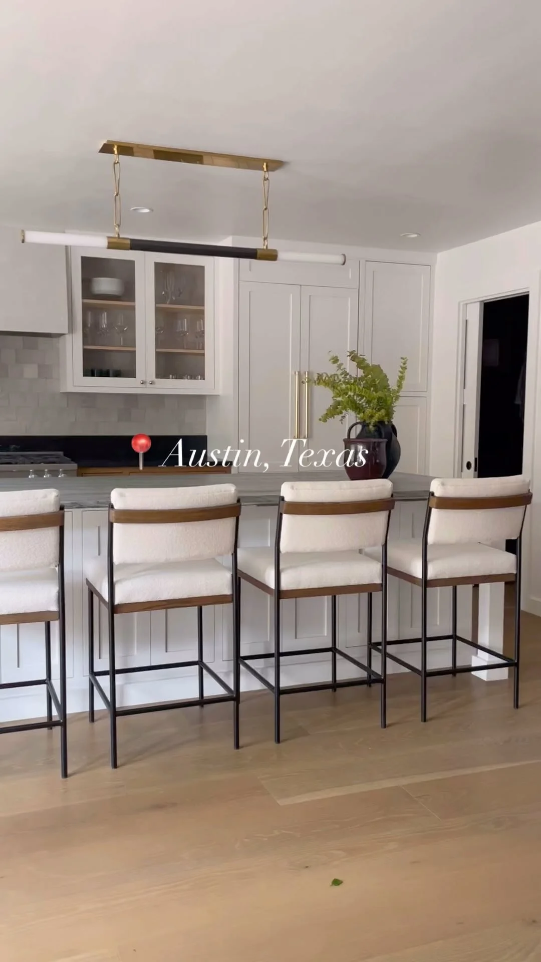
So what we're really talking about is a nod to your team. An homage if you will, inspired by the teams colors, state, traditions, and if I do my research right, even hopefully some artists and makers from their home state. Obviously I'm going to start with Texas. My sweet sweet Longhorns, it's looking like yet another holding-on-by-the-seat-of-our-pants season, but I love them none the less. Luckily cow skulls have been trending pretty hard as well as textiles with a southwest flair. Austin, Texas inspires thoughts of natural materials, rustic elements, all with a creative and eclectic flair. These are some images I found that I think encompass the kind of room I could hang out in all day and slip into a nostalgic stupor of college days gone by.

Clockwise from Top Left: Image from The Transatlantic, a midcentury take from Blood and Champagne, one of my favorite inspiration images of all time from DesignSponge, and finally this comfy stunner from none other than House Beautiful
So how can you get this feel for yourself? Think about Austin's natural, casual elegance; balancing Southern Hospitality and comfort, traditional elements with a bit of bohemian and not so fussy that you can't just come in from a day at Barton Springs, pop open a Fireman's 4 and lounge on the couch to watch the game. Here is my take on a Longhorn-inspired living room!

Sources: Plant stand from Ferm Living, Harper Couch from Interior Define, Coffee table and carved side table from West Elm, Assorted Pillows from Shop Saint Cloud and Amazon, Art Work by the ever so talented Mary H Case for Biscuit Home, Metallic Cowhide Rug Similar at One Kings Lane , the incredible Humphry Chair from Houston's very own Texas Rover Company, and of course that corner-filler extraordinaire: the ubiquitous fiddle leaf fig
What do you think? Can you see yourself cozying down in here with The Eyes of Texas playing softly in the background, a little Rebecca Creek Whiskey in a glass, maybe a bottle from Becker Vineyards about to be opened, and a view of the hill country out your window? A girl can dream. I don't know if any of my other rooms will be this extensive, I can't claim to have ever lived in Ohio (Hey, Buckeyes!) or that I have any particular love for those Aggies ;), but I would love to put as much heart into each room I do this season! So heres where I need your help, who should be next? Feel free to tell me about that team you love so much, the things that make your college town so amazing, and any can't-miss makers in your state! Whats it going to be y'all?


KITCHEN INSPIRATION
UPDATE: This post was written in 2015. We have since finished the kitchen! If you would like to see finished images click through to my portfolio.
Wrightwood is coming up on a pretty serious deadline: I’m moving in! The house will be far from done...but moving in holds some amazing opportunities. I will be getting my hands into the doing at the house: tiling and painting and sanding, oh my! There is something about getting my hands dirty that helps me balance my days. Lately a lot of the hands-on work has been in the hands of the contractors - I will never claim to be an electrician, though it might be pretty cool to learn. Another thing I am not is a woodworker. Ever since that fateful day in the woodshop under the architecture school where the professor outlined every way I could kill or maim myself with power tools, I've been a little shy when it comes to band saws and belt sanders. While this is something I should probably get over, I feel very lucky to have some amazing millwork and finish carpentry people in my life. This brings me to the kitchen: ALL of the cabinets are being delivered tomorrow! You may have seen a sneak peek of the west wall of the kitchen in my Fourth of July instagram last weekend (just wait 'till you see whats at the end of this post!). Having a working kitchen will go a long way in making a construction site feel more like a home...

A kitchen is first and foremost a place of function and the kitchen we started with I'm not sure you could even call a kitchen. Small, cramped, dark, and dingy all come to mind thinking about the original downstairs kitchen. We tore out walls, removed some windows *gasp*, and completely revamped the flow. We opened the kitchen not only to the rest of the house, but opened the rest of the house to the kitchen, allowing for views straight out to the expansive backyard and letting light flow into the heart of the house. The small space at the back that held the washer and dryer was most likely at one point a porch that was enclosed to create a laundry/mudroom/refrigerator space. When we took off the old drywall there was original exterior waterfall siding underneath, confirming our suspicions. Instead of a pantry we have a wall of floor to ceiling cabinets for all your storage needs, a massive four foot wide fridge counter-depth fridge, and we squeezed in an island that houses the sink and the dishwasher.

Through out the process I've been collecting inspiration from around the web, cabinet styles and colors that spoke to me and where I felt the style of the house was going. I almost hate to include this first image in the collage because we ended up with something so darn close to it! I think the kitchen in the upper left is absolute perfection. While the kitchen we ended up with is a bit more polished, and our island is a solid, cabinet filled workhorse, we took a lot of the color and light and material inspiration from this image. The next image is maybe a little out of place but truthfully I'm just looking for a reason, any reason to paint the island green. Everything in this house is going white and I'm itching to infuse something a little more risky and exciting. What do you think? I think that gray in the lower right is also really gorgeous and a little more reserved. I adore the look of two tone cabinets like this but our space is still pretty small so we're sticking with white cabinets on the two side walls, top and bottom, but with the island we could get a little crazy.
From all my inspiration (and let me tell you, this is the tiniest sampling of images) we started shopping around for exactly what we were looking for. Per the usual, a neutral palette started to take shape, which I think is perfect, the next owner of this house will have no problem infusing their own personality into the space, and kitchens can get so cluttered a simple palette can help keep the visual mess at bay. We also let what we found while shopping inform our decisions too, like the 2" by 4" mosaic subway tile we found at Home Depot. I cannot wait to see it installed, the smaller tiles have a really "cute" aspect to them that is missing with the ubiquitous 3" x 6" tiles...my mom keeps referring to the little tiles as "chiclets". Speaking of tile, the tile floor has been down for a while (probably the first new thing is the house in this whole process). I want a cleaned up farmhouse look in the kitchen - the cabinets are simple with shaker-style paneling. While my parents couldn't quite get behind full-on brass fixtures, we compromised on some Delta fixtures in their "champagne bronze" finish - a softer, but still warm finish I can totally get behind. One of the greatest challenges at Wrightwood is balancing my more modern, eclectic, mid-century-leaning style with my parents' more traditional, historically accurate point-of-view. I like to think we're striking a happy medium.

1 | Dovetail Gray - Sherwin Williams 2 | Daltile 2" x 4" Subway Tile Mosaic 3. Brass Drawer Pulls 4 | Ikea RANARP pendant 5 | Custom White Shaker Style Cabinetry 6 | Walnut Butcher Block Countertop 7 | Delta Trinsic Faucet 8 | Porcelain 12" x 24" Slate-Look Floor Tiles via Thorntree 9 | Carrera Marble Countertop
I will leave you with this progress shot of the kitchen. The next time you see anything about the kitchen on this blog it will be all done. I can hardly believe how far it's come, and I'm deeply in love with everything thats happening. This past weekend we started sanding floors to prep them for new stain, and as soon as all the sanding is done we'll start painting walls. Our next big push after the kitchen is the bathrooms, as of right now only the powder room is (somewhat) done. So much is happening all at once I'm not sure what I'll be sharing with you next, but be sure to tune back in, it's just starting to get good!


MEET LAUREN LOUISE —
An alum of the University of Texas at Austin School of Architecture, Lauren has been working in the design field for over a decade. Lauren carries her passion for construction and sustainability into the interior design space with holistically created interiors that play off of the existing architecture of a home. When she’s not in her home office she is enjoys evening walks through her historic Houston neighborhood with her husband, planning her next trip (London or Rome are long-time favorites), or digging around in her yard in an attempt to cultivate a green thumb. Read More
FOLLOW ALONG WITH ME