LLD REVEALS: REDWOOD'S EQUESTRIAN BATH

Design: Lauren Louise Design | Photography: Madeline Harper
I first wrote about the plans for this bathroom all the way back in MARCH 2019! (See the post about our design plans here.) I held off on photographing this space until the kitchen was finished too (so I was only flying my amazing photographer Madeline Harper out to the middle of nowhere once!). The kitchen finished up in the Spring of 2020….and we all know what happened then. Seven months later…
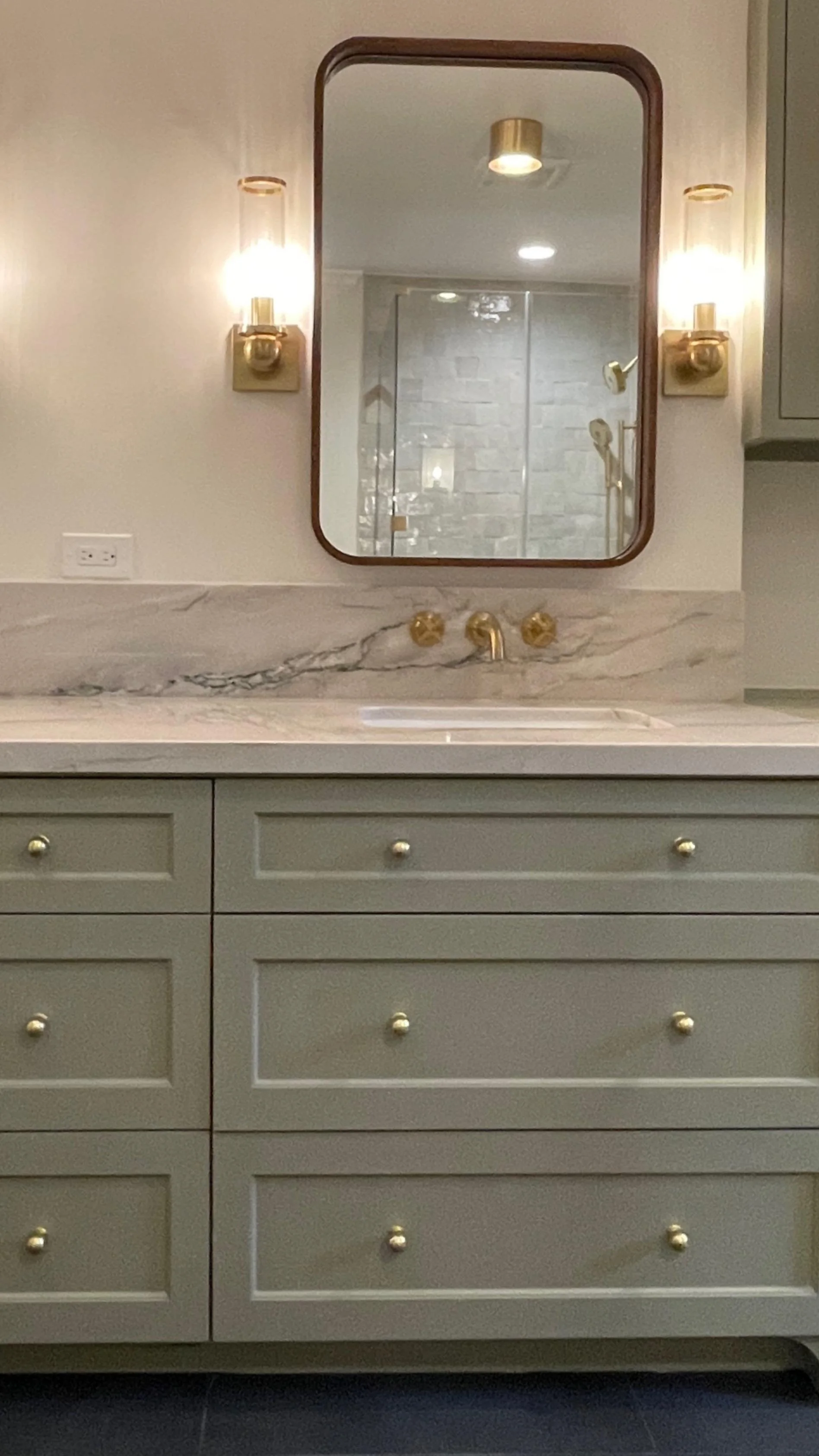
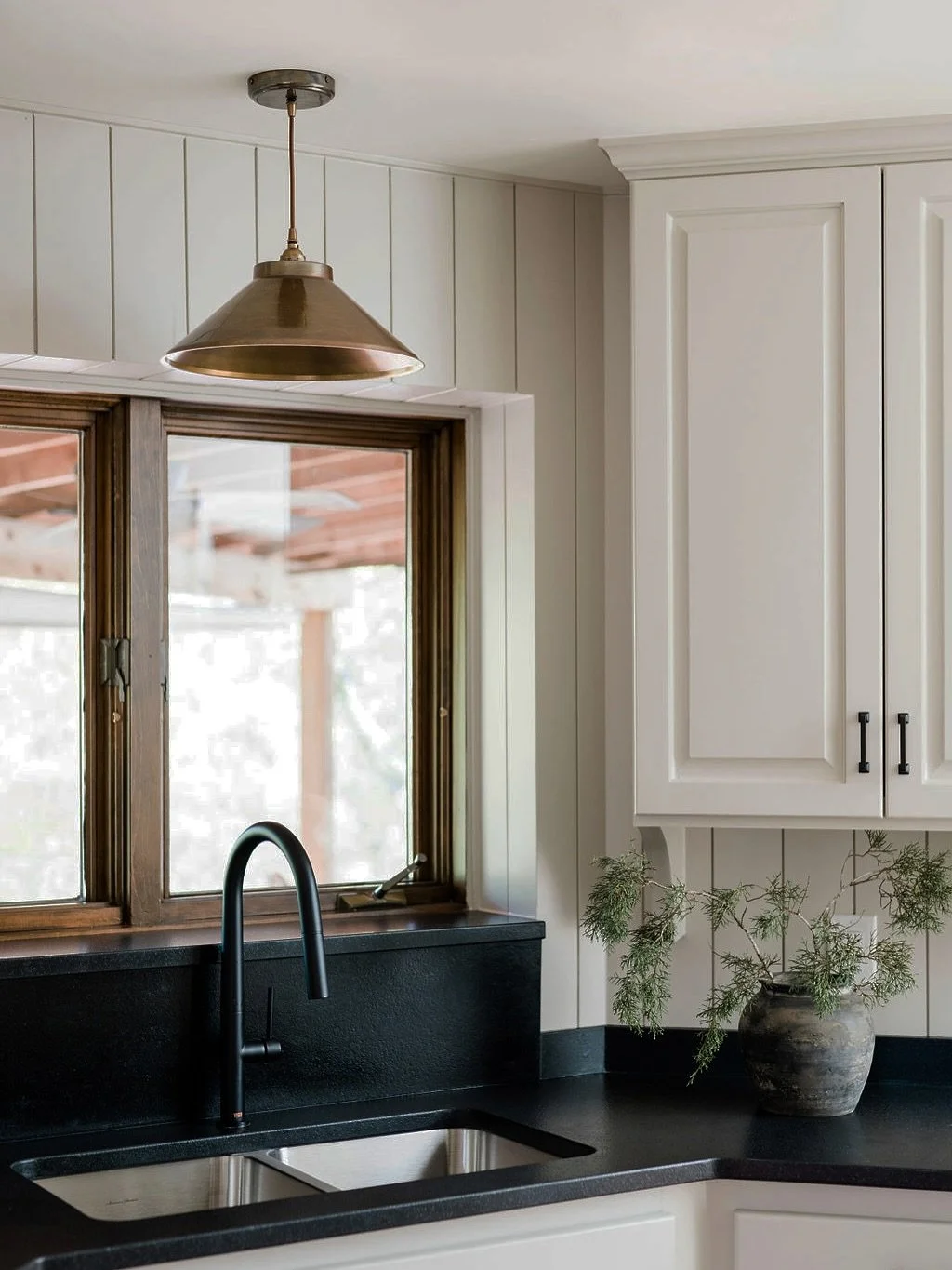
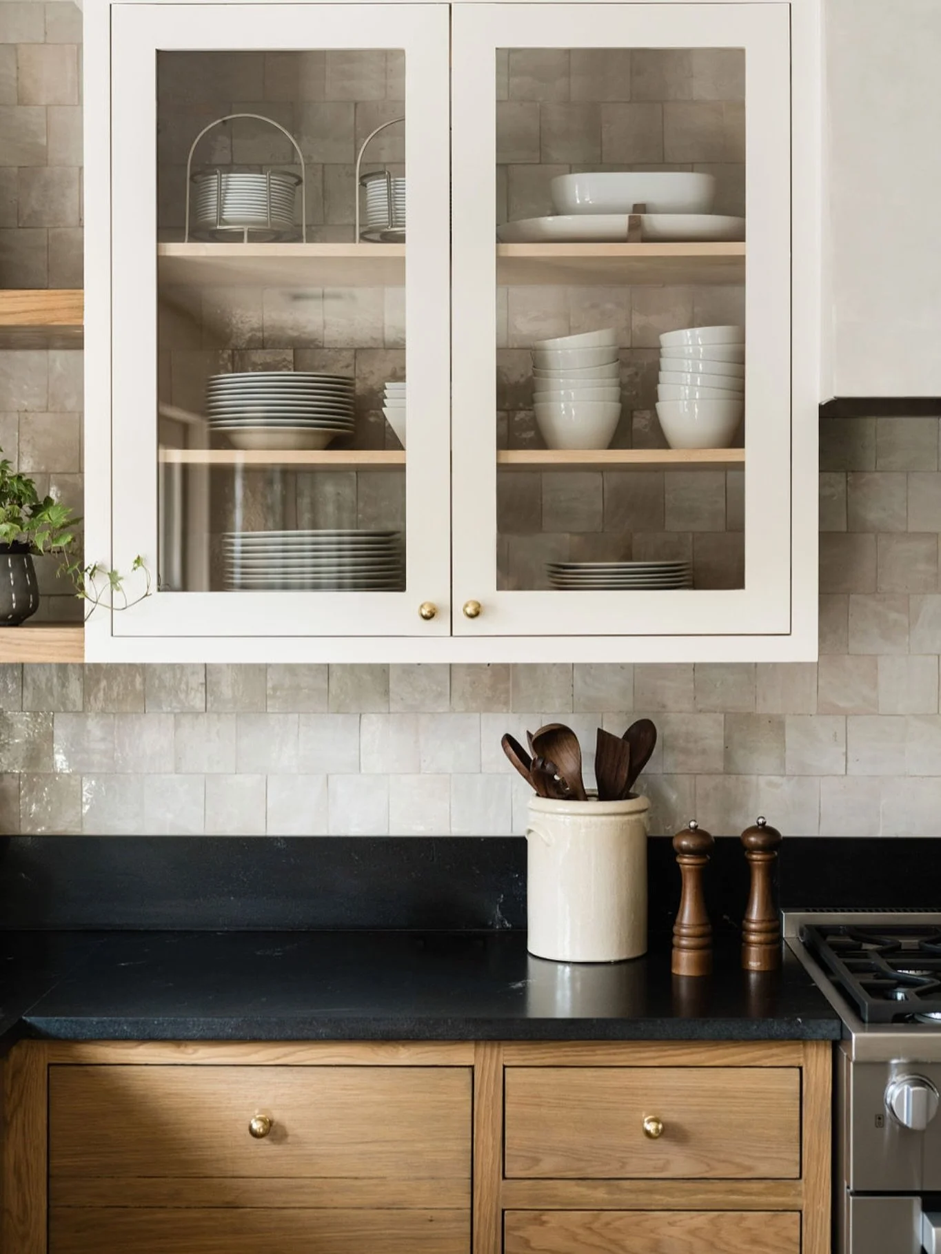
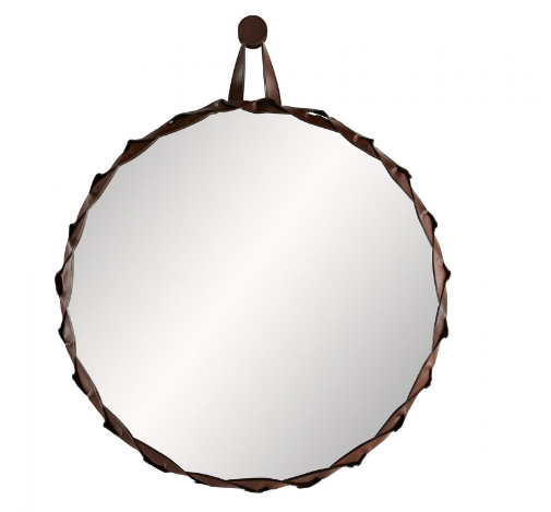
October 2020 things had started to feel….ok again. We risked a flight out to California to get the finished spaces in this house shot. I was not disappointed. It’s hard to say what my favorite thing in this room is…the spacious shower, the perfectly delicate lighting, the gorgeous leather wrapped mirror. OK, it’s the mirror. Ya’ll this thing was the jumping off point for the whole design. The subtle nod to the homeowners equestrian roots is honestly everything. I hope you enjoy this space as much as I do and for even more images head over to my portfolio!


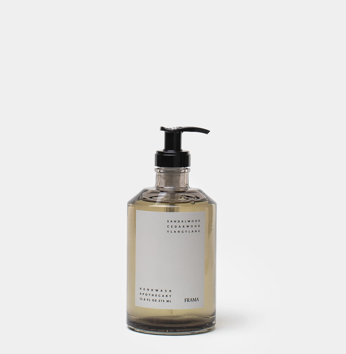
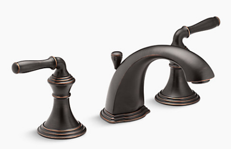
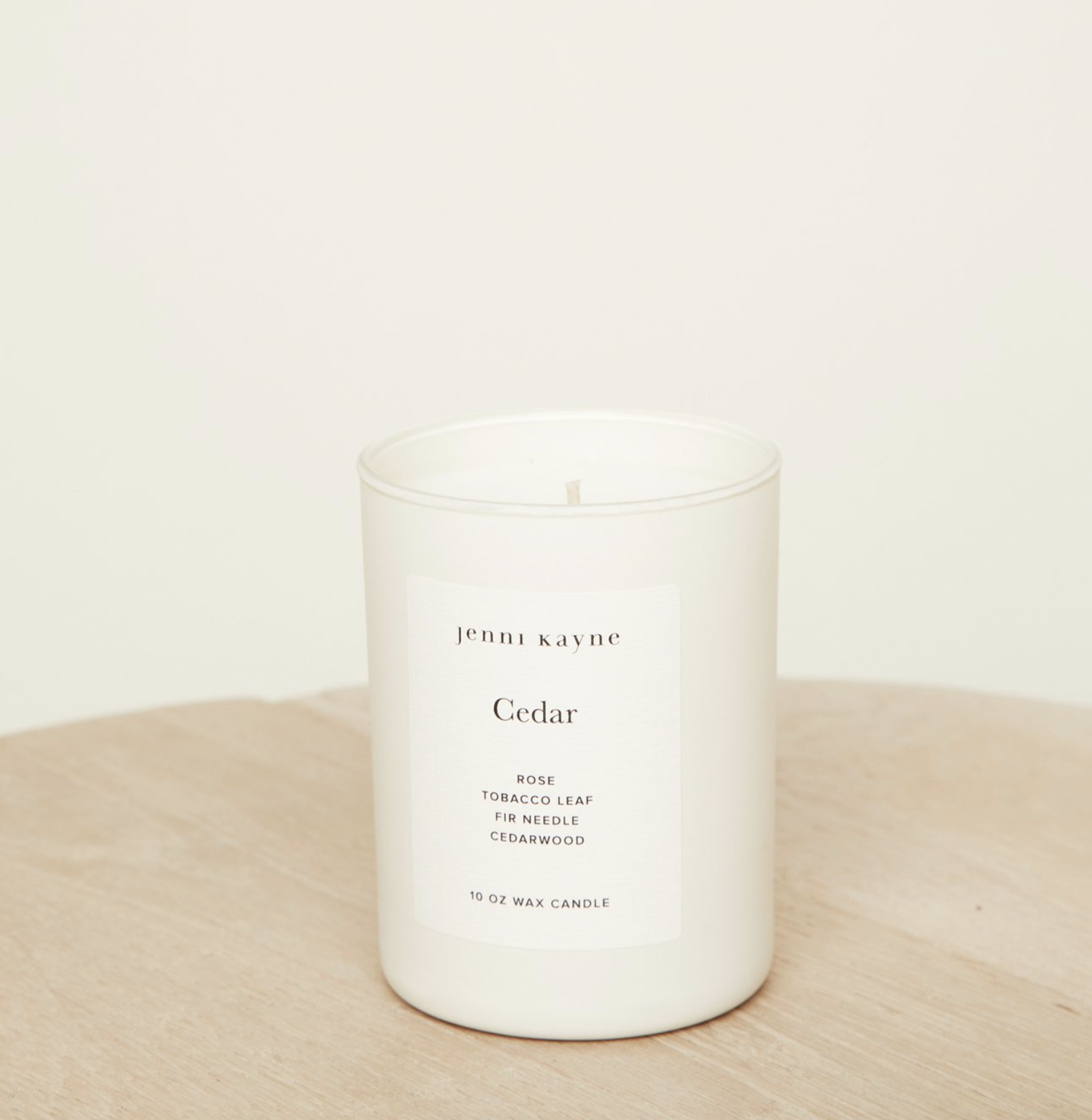
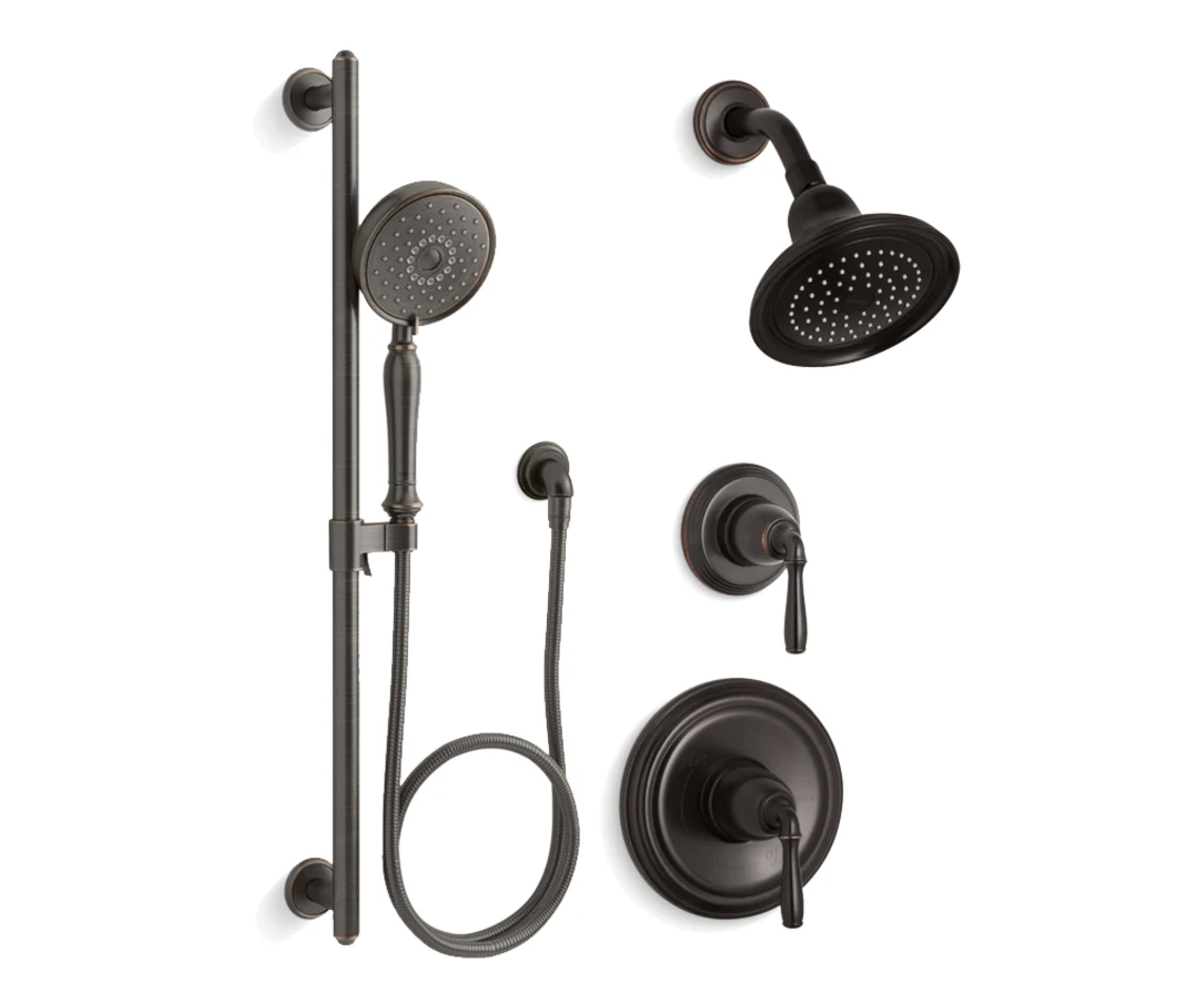
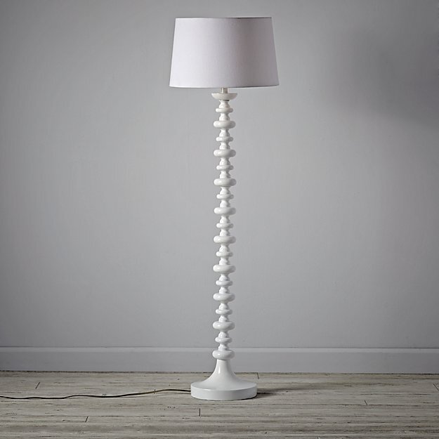
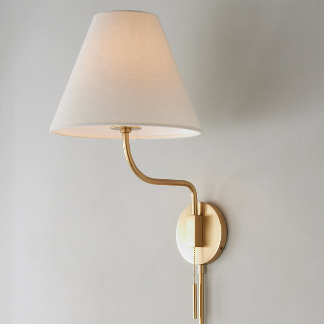
SHOP THIS BATHROOM
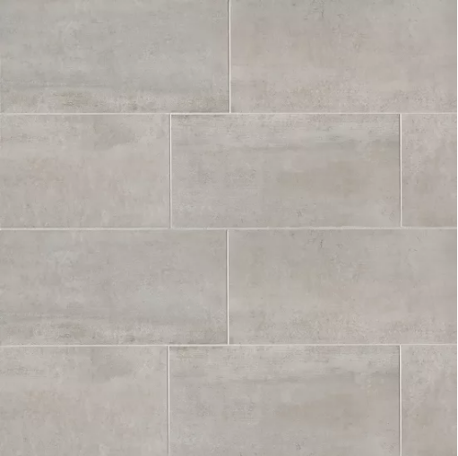
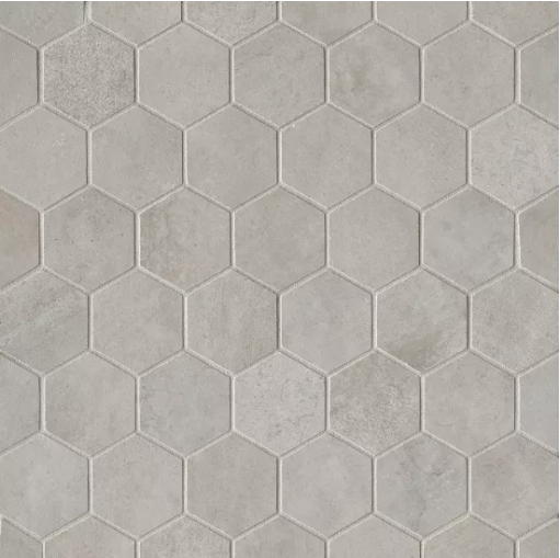


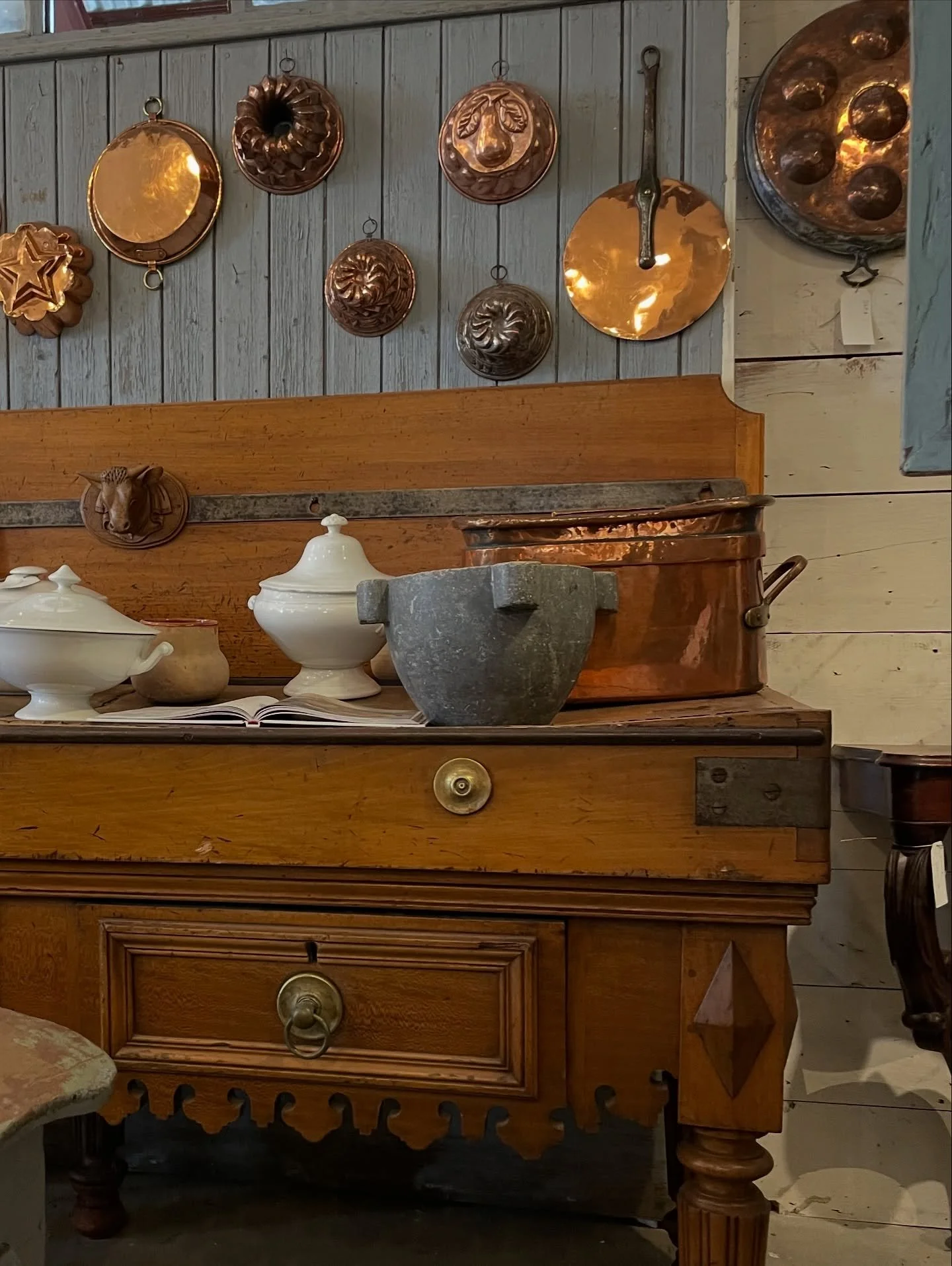
We carved this generous bathroom out of what was previously a bay-of-the-garage-turned-formal-dining-room that just didn’t work for the way the family lives in their home. In my previous On The Boards post about this room you can see before photos and floor plans for how we broke up the large open room to give them not only an extra bathroom, but a spare bedroom/office and a much needed wine closet! I’m so sad the floor tiles we used throughout are no long available but I linked a very similar look from Bedrosians Tile & Stone above in the “Shop this Bath” carousel.


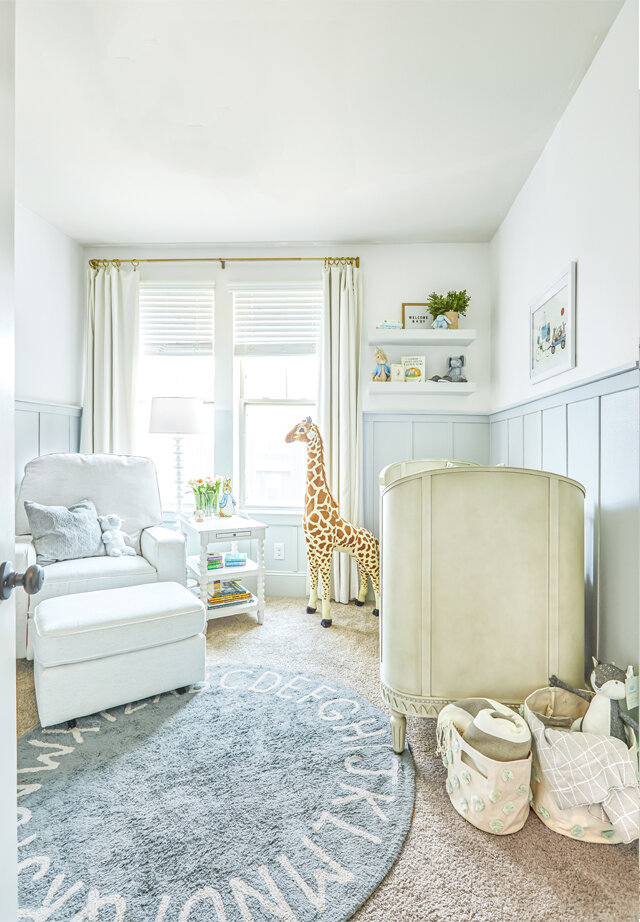
LLD REVEALS: SOFT BLUES FOR BABY BOY

It’s about time! Sweet little baby Pierre was born almost S I X months ago and I think it’s safe to say he’s enjoying this gorgeous nursery (though I hazard to say his mom is enjoying it even more.) If you need a refresher on where we started check out this post on the design.
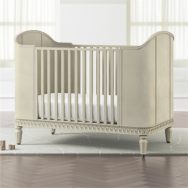
Just a few of the things I love about this room: the light airy colors that provide the perfect calming backdrop to all the baby things, the crib made for a prince, and the board and batton we added that took the room from builder-grade to classic and elevated. Did I mention dad and granddad installed and painted everything themselves?
What I love the most though was this text from mama after her little baby boy was born:
“His room is my calm zone. I love being in there… I’m calm, I’m with the baby. It’s our happy place. It’s the one room in our house that is purposeful and uncluttered.”
I can’t begin to tell you how good that makes me feel, because lets be real for a second, nurseries are really for the parents aren’t they?

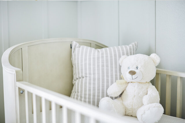
This wasn’t a huge room, we had space for just the basics: a crib, glider, and changing table/dresser. The room already had a great closet and painting the doors out in the trim color made everything look that much more custom. The door to the room swings open adjacent the two closet doors, this worked out so that you can see straight from the master bedroom to the crib.
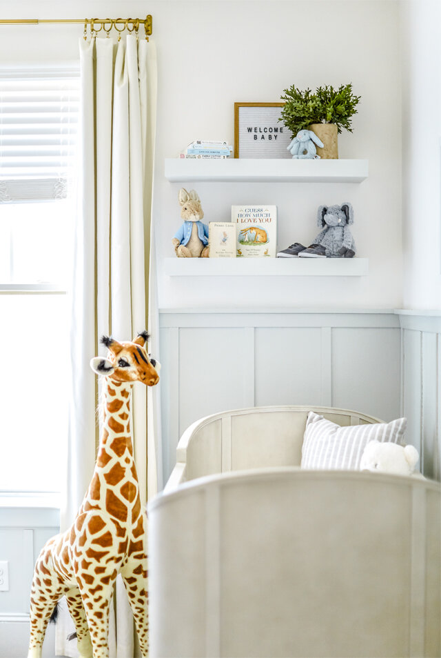

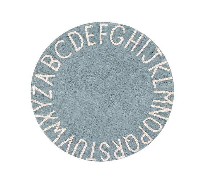
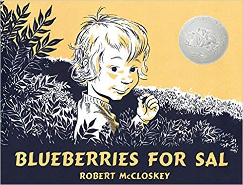
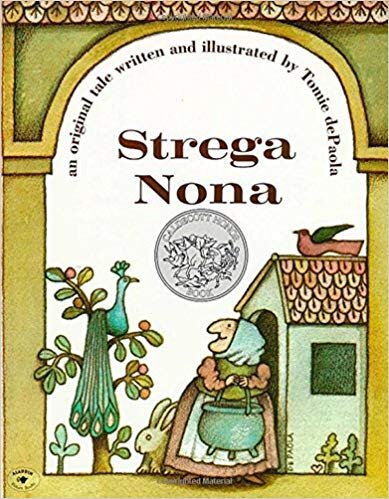
The floating shelves at the end of the crib provide the perfect place for cherished keepsakes and favorite books and allowed for a moment of styling in an otherwise very functional room. The crib is pulled away from the wall, far enough that nothing could fall in or as baby boy gets bigger he won’t be able to reach the shelves and pull things down either. Don’t you LOVE those little shoes?

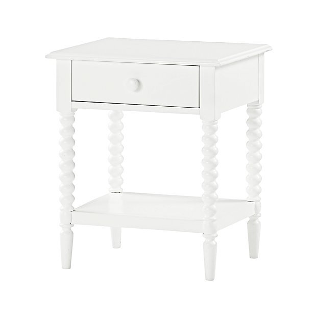
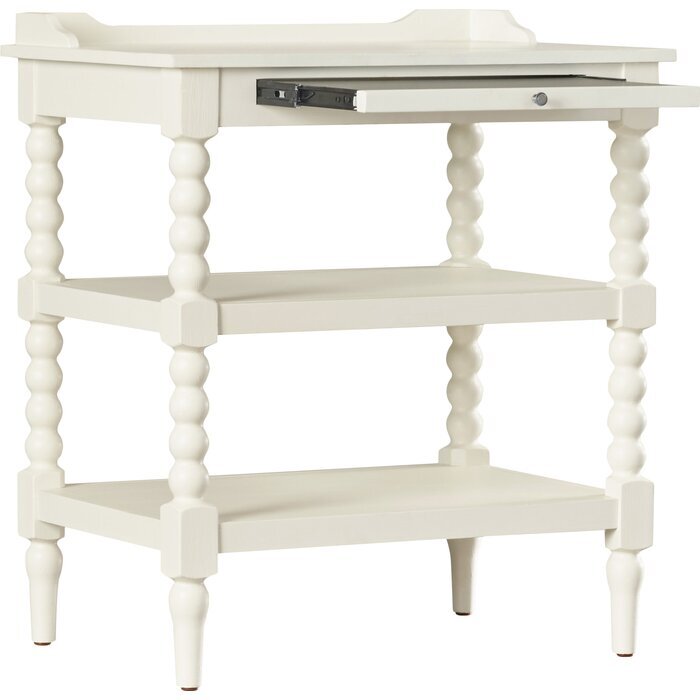
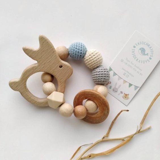
This nightstand has the softest lines and plenty of storage on the two shelves. We paired back the books for the shot but believe me, the book collection is strong (I included a round up of some books and toys at the end of this post)! I love the little pull out at the top of the nightstand perfect for a bottle or coffee mug when the table top inevitably gets full of toys/books/pacifiers/etc. Unfortunately this exact one is now discontinued but I’ve linked a very similar one from Crate and Barrel. This is a table that looks as much at home in this little boy’s nursery as it would be in a future guest room or little girls room; a piece that can grow with this family.
S H O P T H E P O S T

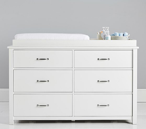

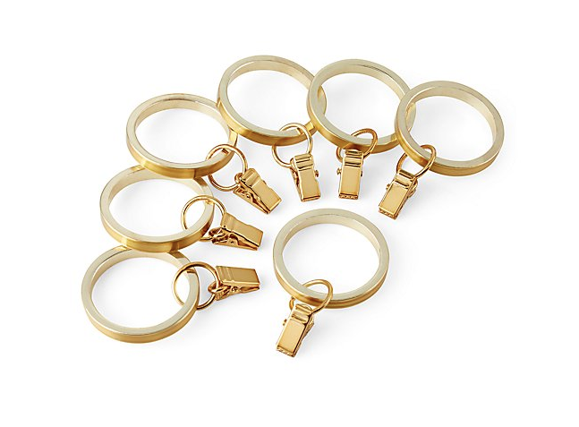


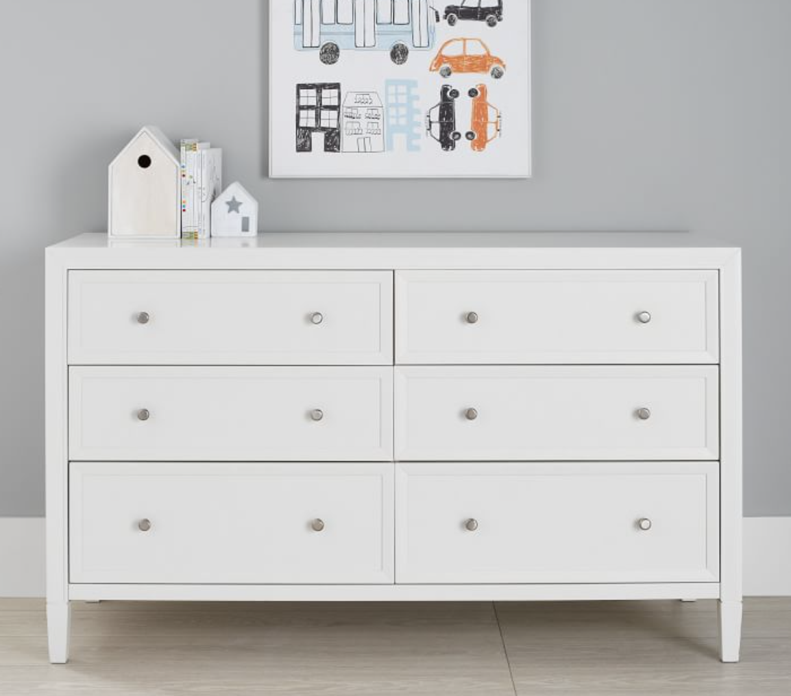
The changing table is between the entry and bathroom door, opposite the window. The dresser was from Pottery Barn Kids, I loved the simple lines and that it’s constructed of FCS certified wood and sealed and painted with non-toxic materials. This is another furniture piece that will grow with the family and could be used anywhere in the house. We did upgrade the hardware to these brass cup pulls to match the curtain hardware and sconce and soften the look a little. Unfortunately this particular dresser has since been retired but see below for some with a similar look. Verify that your changing tray will fit on top. The shaded plug in sconce is perfect for late night diaper changes. And not to be too TMI but the tall wainscoting, painted in Farrow and Ball Pale Powder, is wipeable.
S i m i l a r D r e s s e r s
S H O P f o r B a b y


This was easily one of my favorite projects to date, and obviously very close to my heart. My favorite parts are a three-way tie between the wall paneling, the rug and the floating shelves! Whats your favorite part?
Photography by Allyson Huntsman Photography
This post contains affiliate links. This means I may make a small commission if you end up purchasing, at no extra cost to you. Please read my disclosure for more info.


SPRINGTIME COLORBLOCKING

I have been silent for far too long and I can't be kept quiet anymore! I want to talk about color blocking. Ya'll. You're probably seeing it everywhere, accomplished with varying degrees of contrast and ingenuity, and you will soon see it all over the yoga studio (that is so so close to being done I can taste it. Or well, not taste it. I'm sure yoga studios don't taste great....and if a yoga studio DID taste great, this one would. Get excited Houston.) With that being said I thought I'd round up a few of my most favorite examples of color blocking from around the web. When done right color blocking adds instant impact, defines space, and can be so unexpected yet PERFECT. And it's just paint. What I'm trying to say is that it's amazing and you should try it ASAP. (Plus if you stick it out to the end of this post you get a sneak peek of some of the color blocking I've been playing with in the yoga studio....)

Clockwise from top-left: color blocked workspace from Simply Grove, drop shadowing a window via Remodelista , sneak peek-through via IKEA, pop of color on a column - image via Frenchy Fancy
These first images really get my color blocking juices flowing. The first image is BOLD - teal and grey and ceilings and walls and doors, oh my! The teal being painted almost a quarter of the way down the wall gives the impression of extremely grand crown moulding while simultaneously taking full advantage of the already soaring ceilings. Next is the bedroom image. I love me some serious white on white on white, but that pop of yellow is just so much fun, breaks up the room, and plays with your perception of the window as an object. The image from IKEA (love the Kallax units that look like they've had a little toe-kick built out under them). This might not meet a strict definition of color blocking since we're looking through one room and into another, but suddenly the opening in the wall goes from negative space to positive and creates a layered effect similar to painting a big teal rectangle on a wall. The final image shows how color blocking doesn't need to be a wall-only commitment. Painting the column turns it from a functional obstruction in the room to a piece of furniture or art! It plays nicely with the color scheme and is so much fun. We did something similar at Big Memorial and it's one of my favorite moments.

Clockwise from top-left: Drama x1000 via Lonny, some springtime dining via Inside-Out, a focused office from Chez Larsson , this pretty pink bedroom via The Life Creative
I am completely obsessed with the full range of spring hues - childhood tomboy be damned: I love pastels. They're so fresh and surprisingly modern. I think possibly my favorite color blocked room ever is the traditional green one. So bold, so fantastic and yet so livable. I could spend all day everyday in that sun drenched, playful, beautiful room. Purple though, might just be my favorite color (of the moment). A month ago I was seconds away from begging my hairdresser for purple hair exactly this shade. This dining room makes me so happy. White and bright and modern and avocado toast instagrammed everyday. This green workspace on the other hand would really help me focus on keeping this blog consistent - and is great for any of you who may feel a WHOLE wall is too much. Also green is a color known for inspiring innovation (via a great study by my alma mater and past professor) - a great color for all the creatives out there! And finally completing my pastel-trifecta: PINK! When I was little my mom used to tell me that pink rooms caused people to go insane. So what did I do? I painted by bedroom pink (thanks Mom!). And I loved it. And I like to think I'm not insane, but rather well adjusted and happy!
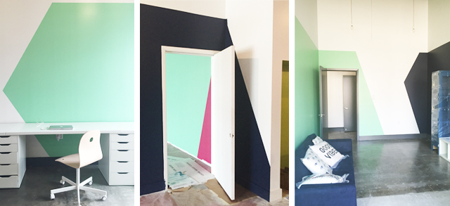
So you made it through to the end of this somewhat wordy post and heres your reward! A Big Memorial sneak peek! Want to see more? If you're in Houston we're scheduled to open THIS week - otherwise stay tuned! As soon as I find a great interior photographer in these parts (or find some faith in my own photographic abilities) I'll post a full, color filled tour!
I know I'm feeling inspired to splash paint on everything! If you could throw some paint up on your empty walls right now which room would you pick and what color would you choose?


MEET LAUREN LOUISE —
An alum of the University of Texas at Austin School of Architecture, Lauren has been working in the design field for over a decade. Lauren carries her passion for construction and sustainability into the interior design space with holistically created interiors that play off of the existing architecture of a home. When she’s not in her home office she is enjoys evening walks through her historic Houston neighborhood with her husband, planning her next trip (London or Rome are long-time favorites), or digging around in her yard in an attempt to cultivate a green thumb. Read More